Branding
BreezeOps
BreezeOps helps home care businesses stay organized and efficient by creating custom systems and automations on Monday.com. Their solutions ensure every client receives the attention they need and no detail falls through the cracks. By streamlining workflows and tracking caregivers and clients in one place, BreezeOps allows teams to focus on what matters most, helping people.
Year :
2025
Industry :
SaaS
Client :
BreezeOps
Project Duration :
4 weeks

Problem :
The color palette uses mostly blues to convey trust, reliability, and professionalism, while softer shades and complementary tones add warmth and approachability. This combination reflects BreezeOps’ relational and supportive personality, making the brand feel accessible, personable, and easy for home care teams to engage with.
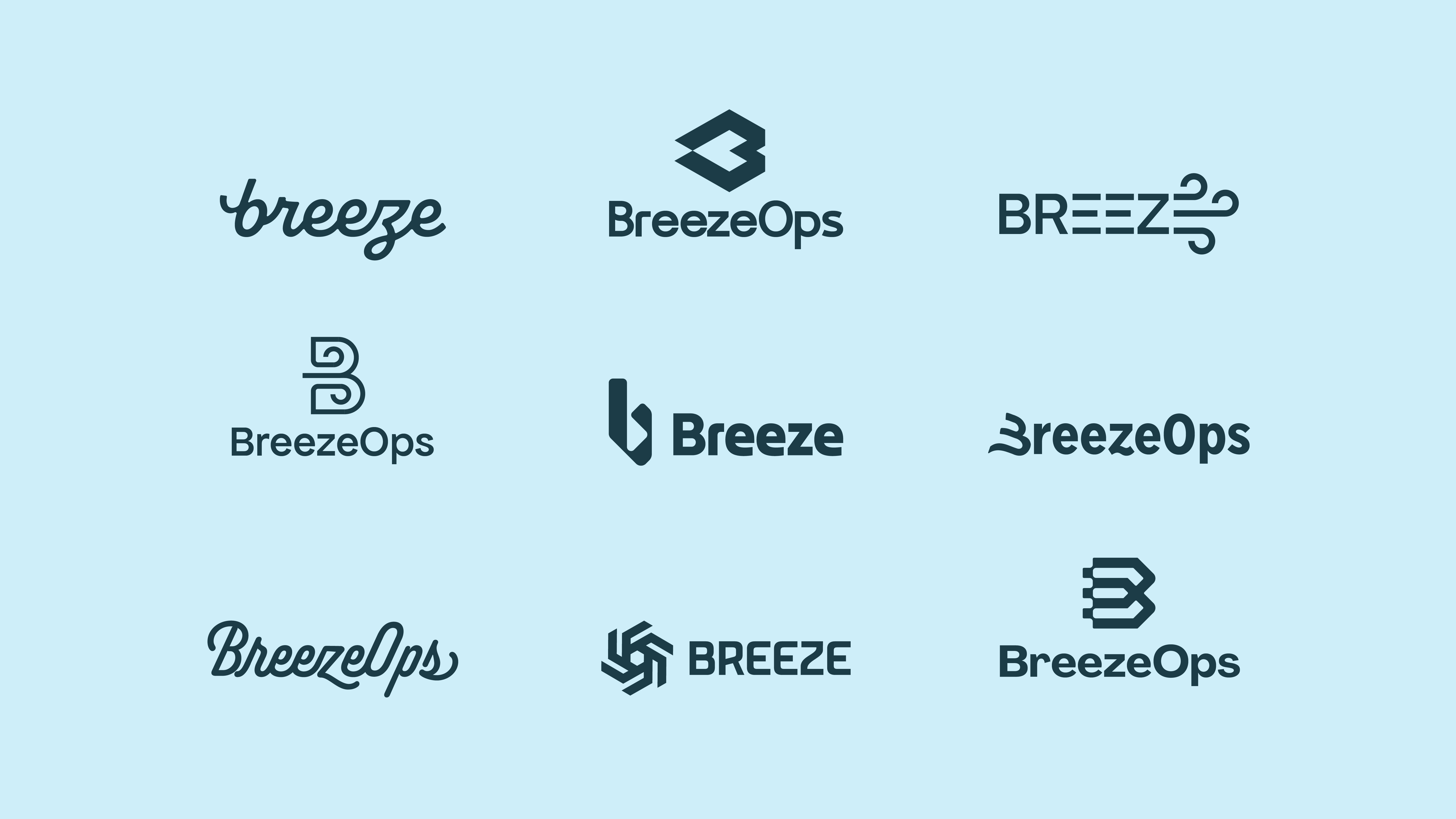
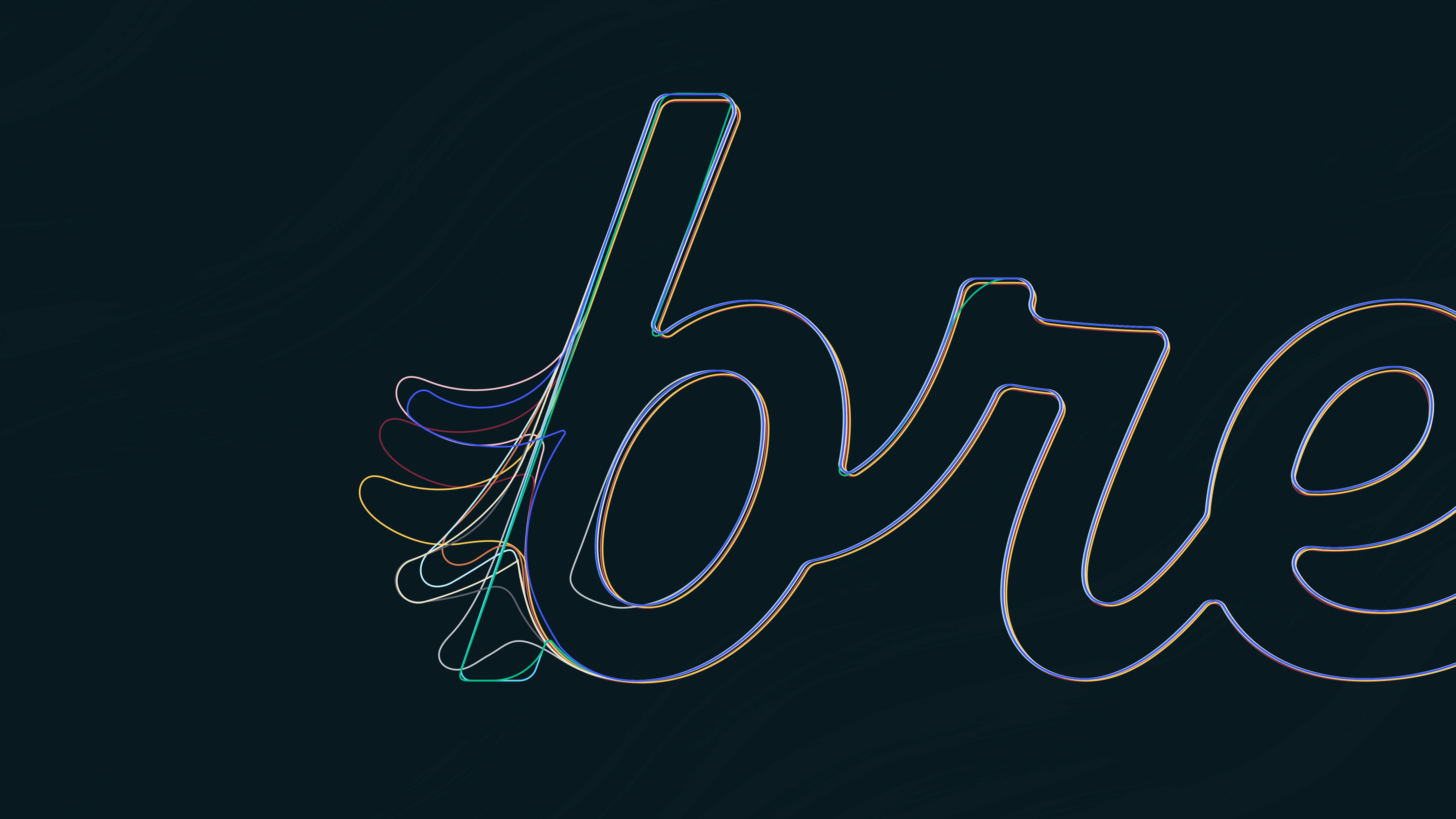
REFINING THE "B"
I spent a lot of time refining the tail of the “b” to create a soft, flowing detail that embodies the BreezeOps brand. Through multiple iterations and subtle adjustments, it was refined to feel gentle, light, and breezy, giving the logo a welcoming and approachable character.
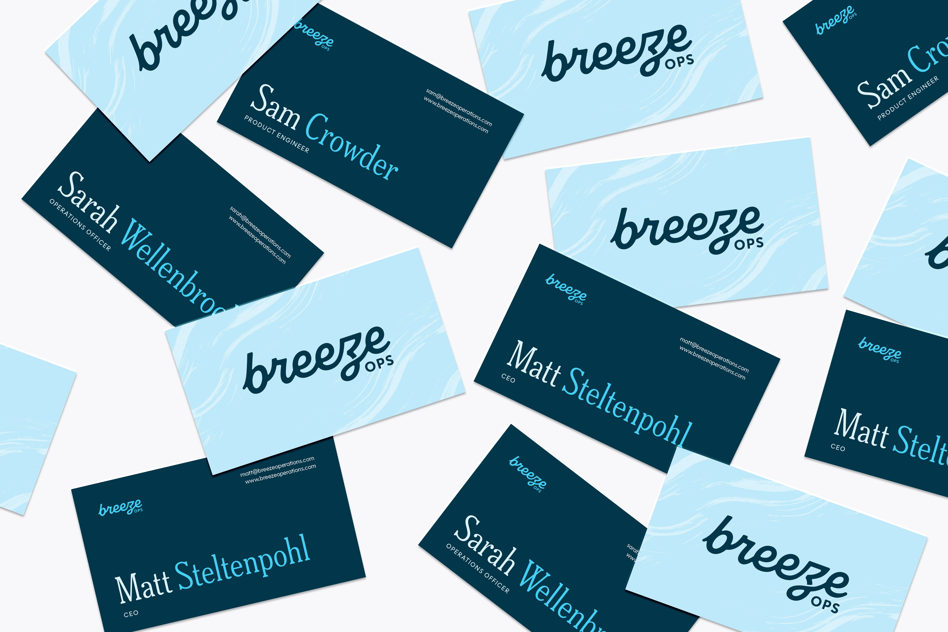
IN ACTION
The business cards use BreezeOps’ blue palette to evoke a sense of calm, trust, and the gentle feeling of a breeze. Hand-drawn background strokes add a human, breezy touch, reinforcing the approachable and welcoming nature of the brand while keeping the overall design professional and clear.
ILLUSTRATIONS
he illustrations were adapted from stock assets and modified to align with BreezeOps’ color palette, brand tone, and solutions. Each image was adjusted to feel approachable, human, and supportive, helping communicate complex workflows in a way that is clear, friendly, and visually cohesive with the overall brand.

More Projects


Branding
BreezeOps
BreezeOps helps home care businesses stay organized and efficient by creating custom systems and automations on Monday.com. Their solutions ensure every client receives the attention they need and no detail falls through the cracks. By streamlining workflows and tracking caregivers and clients in one place, BreezeOps allows teams to focus on what matters most, helping people.
Year :
2025
Industry :
SaaS
Client :
BreezeOps
Project Duration :
4 weeks
Problem :
The color palette uses mostly blues to convey trust, reliability, and professionalism, while softer shades and complementary tones add warmth and approachability. This combination reflects BreezeOps’ relational and supportive personality, making the brand feel accessible, personable, and easy for home care teams to engage with.
REFINING THE "B"
I spent a lot of time refining the tail of the “b” to create a soft, flowing detail that embodies the BreezeOps brand. Through multiple iterations and subtle adjustments, it was refined to feel gentle, light, and breezy, giving the logo a welcoming and approachable character.
IN ACTION
The business cards use BreezeOps’ blue palette to evoke a sense of calm, trust, and the gentle feeling of a breeze. Hand-drawn background strokes add a human, breezy touch, reinforcing the approachable and welcoming nature of the brand while keeping the overall design professional and clear.
ILLUSTRATIONS
he illustrations were adapted from stock assets and modified to align with BreezeOps’ color palette, brand tone, and solutions. Each image was adjusted to feel approachable, human, and supportive, helping communicate complex workflows in a way that is clear, friendly, and visually cohesive with the overall brand.
More Projects
Branding
BreezeOps
BreezeOps helps home care businesses stay organized and efficient by creating custom systems and automations on Monday.com. Their solutions ensure every client receives the attention they need and no detail falls through the cracks. By streamlining workflows and tracking caregivers and clients in one place, BreezeOps allows teams to focus on what matters most, helping people.
Year :
2025
Industry :
SaaS
Client :
BreezeOps
Project Duration :
4 weeks
Problem :
The color palette uses mostly blues to convey trust, reliability, and professionalism, while softer shades and complementary tones add warmth and approachability. This combination reflects BreezeOps’ relational and supportive personality, making the brand feel accessible, personable, and easy for home care teams to engage with.
REFINING THE "B"
I spent a lot of time refining the tail of the “b” to create a soft, flowing detail that embodies the BreezeOps brand. Through multiple iterations and subtle adjustments, it was refined to feel gentle, light, and breezy, giving the logo a welcoming and approachable character.
IN ACTION
The business cards use BreezeOps’ blue palette to evoke a sense of calm, trust, and the gentle feeling of a breeze. Hand-drawn background strokes add a human, breezy touch, reinforcing the approachable and welcoming nature of the brand while keeping the overall design professional and clear.
ILLUSTRATIONS
he illustrations were adapted from stock assets and modified to align with BreezeOps’ color palette, brand tone, and solutions. Each image was adjusted to feel approachable, human, and supportive, helping communicate complex workflows in a way that is clear, friendly, and visually cohesive with the overall brand.